Effects and Overlays
Backgrounds, text, annotations, blur regions, overlays, and keyboard sounds.
Effects are what turn a raw recording into something you'd actually publish. Everything on this page is non-destructive — the original video is untouched, and anything you add can be moved, restyled, or removed without reshooting. This is where Screen Bolt earns the "studio" in "studio-quality recording."
Background
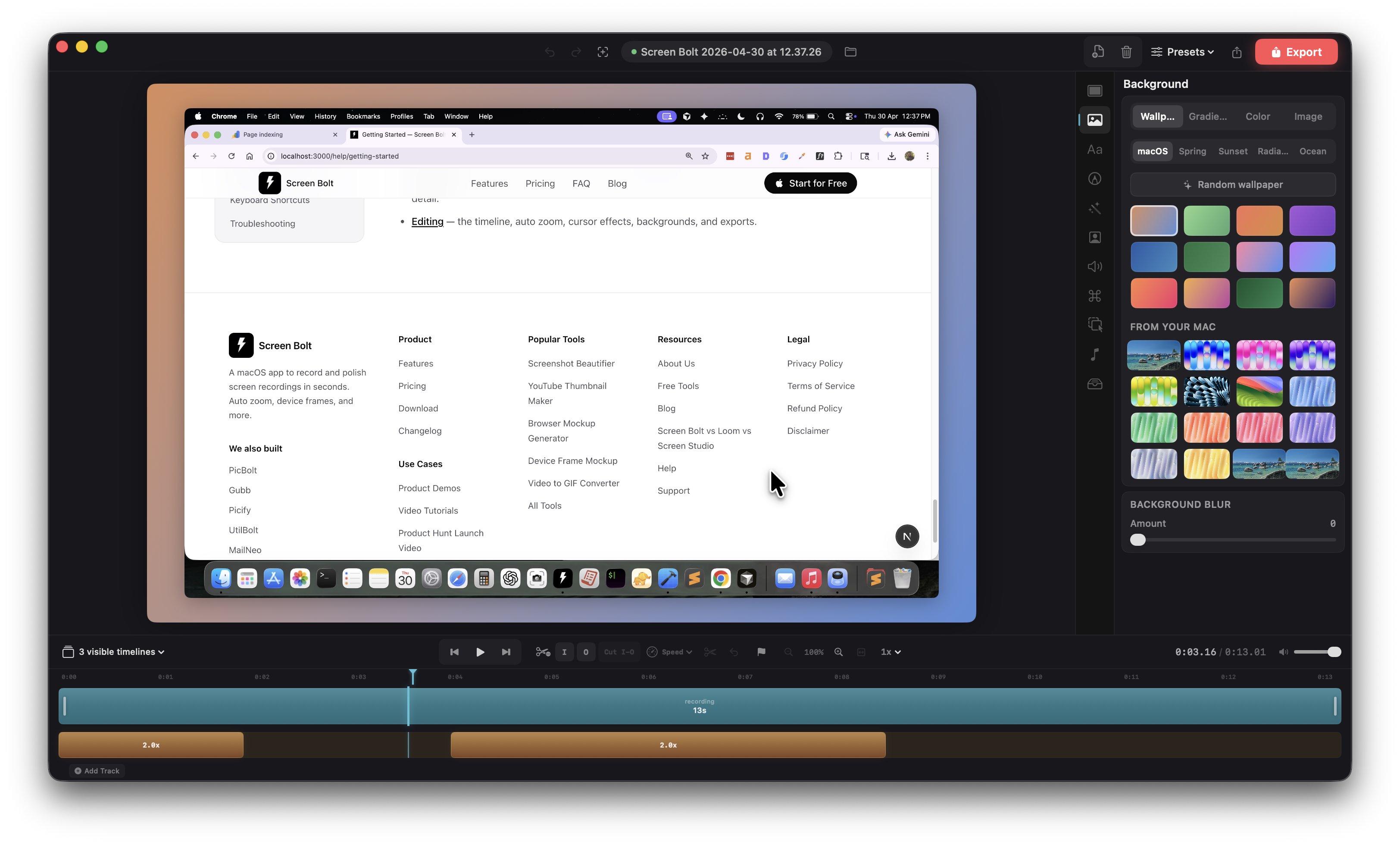
The Background panel (<kbd>⌘2</kbd>) controls the canvas behind your screen content. Four styles to pick from, all of them exported at full resolution.
- Wallpaper. Twelve presets —
macOS,Spring,Sunset,Radiance,Ocean,Forest, plus direct nods to shipped macOS wallpapersBig Sur,Monterey,Ventura,Sonoma,Sequoia, andMojave. Each one is a tuned two-color gradient. - Gradient. Pick two colors with the native color picker and Screen Bolt interpolates between them.
- Color. Solid fill. Useful for brand backgrounds.
- Image. Drop in any JPG or PNG, or pick from your Mac's installed system desktop pictures (Screen Bolt scans
/System/Library/Desktop Picturesand the Sonoma+ wallpapers folder). The current desktop wallpaper is highlighted so you can match the look of the surrounding OS in one click.
The Blur slider (0 to 30) blurs whatever's behind the screen frame — handy when an image background is too busy and you want to keep just the color cast.
Screen frame
The Screen panel (<kbd>⌘1</kbd>) is about the screen content itself, floating on top of the background.
- Padding. How much space to leave between the screen edge and the canvas edge. Drops the screen into a clean floating-card look.
- Corner radius. Round the corners of your recording. Default is 12pt; push it higher for a softer look.
- Shadow. Radius and opacity sliders for the drop shadow beneath the screen.
- Inset padding. An inner margin between the screen and its frame — useful when you're also using a device frame.
Device frames
Wrap the recording in one of eight hardware frames, each with the right screen corner radius baked in:
- MacBook Pro 16" and MacBook Pro 13"
- iPad Air and iPad Mini
- iPhone 16, iPhone 16 Plus, iPhone 15, and iPhone 15 Pro Max
Pick None to skip frames entirely. The optional Reflection toggle adds a soft mirrored image below the device, useful for marketing-style hero shots.
Text overlays
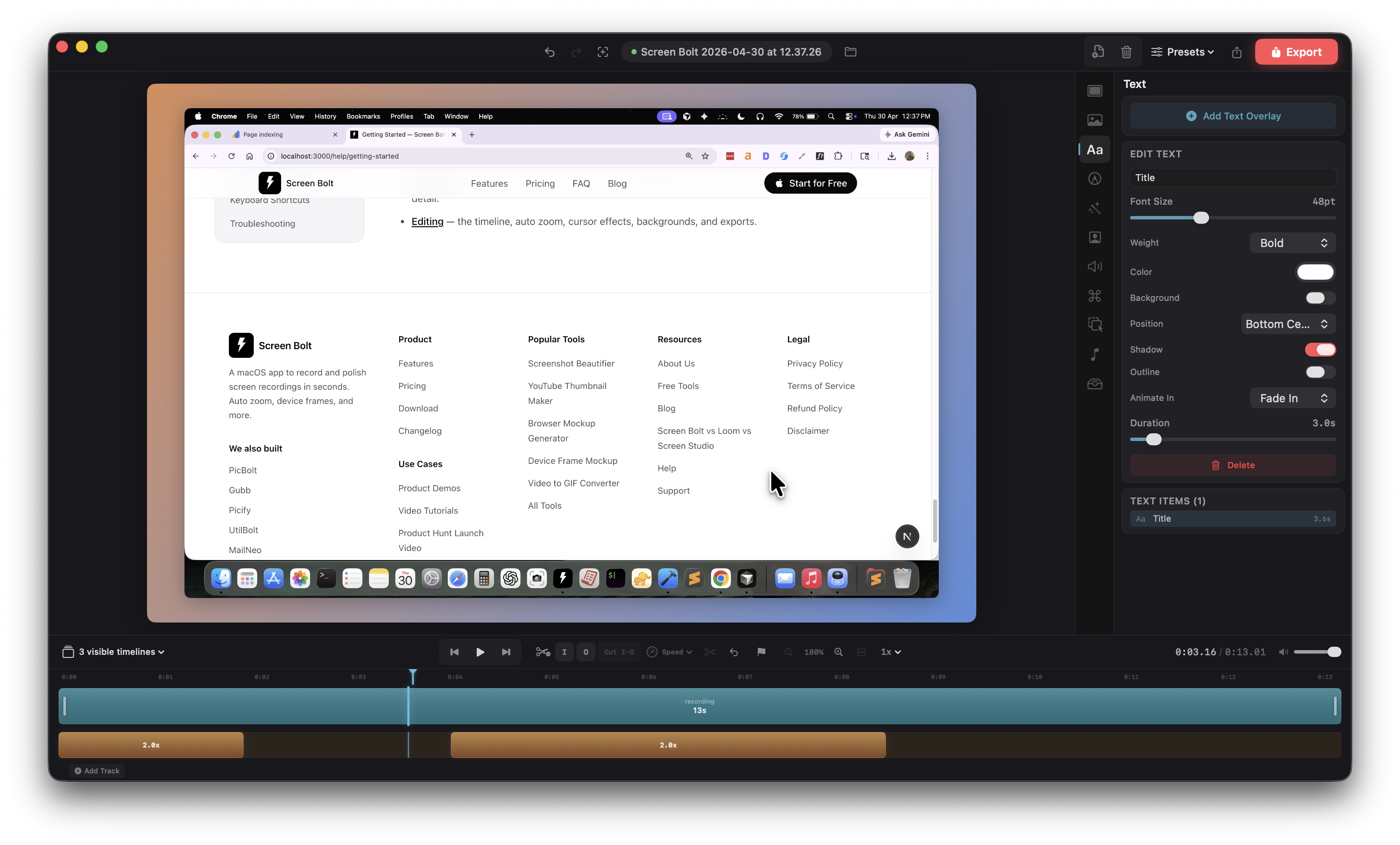
Press <kbd>T</kbd> to add a text overlay at the playhead, or add one from the + menu in the transport bar. New overlays default to a three-second duration on the next available overlay track — drag the ends to extend or shorten, drag the body to move in time.
Each text overlay carries:
- Text content. Edit inline in the Text panel.
- Font size (12 to 120 pt) and font weight (regular, medium, semibold, bold, heavy).
- Text color via color picker.
- Background chip. Optional rounded pill behind the text, with its own color, opacity (10 to 100%), and corner radius.
- Position. Nine presets (top-left, top-center, top-right, center-left, center, center-right, bottom-left, bottom-center, bottom-right) or drag freely in the preview to set a custom position.
- Alignment. Left, center, or right — matters when the text wraps.
- Animation in / out. Fade, slide (up/down/left/right), scale up, typewriter, or none. Both sides animate independently; duration is shared and runs 0.5 to 30 seconds.
- Shadow and outline. Shadow uses a fixed 4 px blur with a soft drop. Outline is a stroke around the glyphs with its own color and width.
Annotations
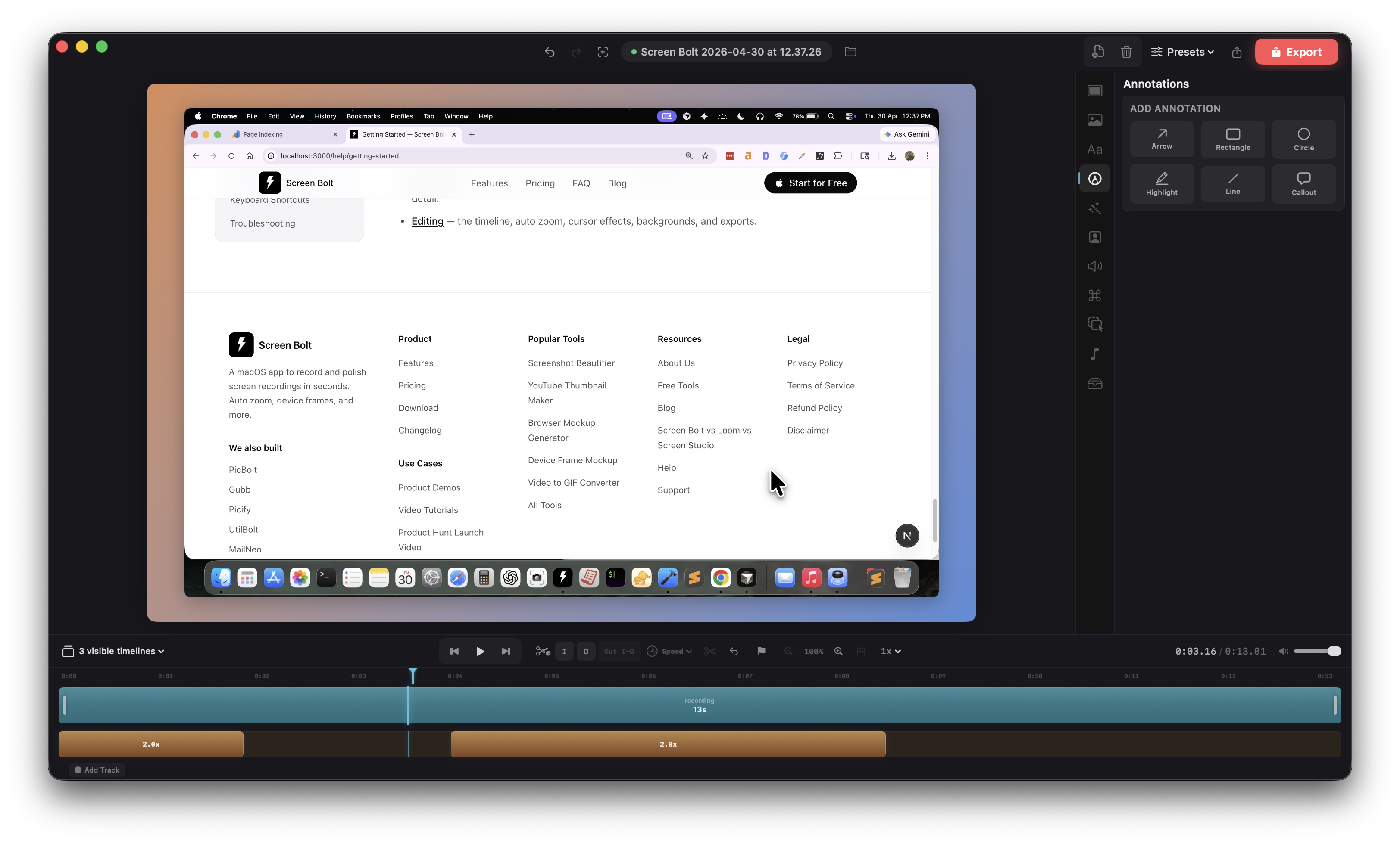
Annotations are shapes drawn over the recording. Press <kbd>A</kbd> in the annotations panel to drop one, or pick a shape from the sidebar. Six shapes:
- Arrow — tail to head, drag either endpoint to reposition. Arrowhead length is 20 px at a 30° angle.
- Rectangle — drag corners as the bounding box. Adjustable corner radius (0 to 40).
- Circle — same corner-based bounding box, rendered as an ellipse.
- Highlight — a translucent rectangle with the fill playing most of the role; baseline 25% alpha so the screen reads through.
- Line — a straight line between two points, stroke only.
- Callout — a speech bubble with an editable text field. Text renders white over your color at 85% opacity, with an 8 px corner radius.
All annotations share color, line width (1 to 10 px), fill opacity (for rectangle, circle, highlight: 0 to 100%), corner radius (rectangle and highlight: 0 to 40), and an animation-in style (none, fade, slide, scale up, typewriter) with its own duration (0.5 to 30 s). Arrows, lines, and callouts ignore the fill-opacity control because they don't have a fill in the same sense.
Blur regions
For hiding sensitive content — email addresses, API keys, license plates, anything you shouldn't publish. Press <kbd>B</kbd> to add a blur region at the playhead, or draw one directly on the preview.
- Drag the region anywhere in the preview.
- Resize by grabbing any of the four corner handles.
- Style. Gaussian (soft blur), Pixelate (mosaic), or Solid Color (opaque block).
- Blur radius slider, 5 to 50, controls strength.
- Corner radius softens the region edges, 0 to 40.
- Animate in. Optional fade-in when the region first appears.
- Position fields. X, Y, width, height as 0–100% of the canvas if you want to nail an exact rectangle without dragging.
The region tracks a fixed rectangle — it doesn't follow moving content. For a moving subject, split the clip at the edges of the section you need to hide and use a blur region scoped to each segment.
Focus regions
Focus regions are the inverse of blur regions: they keep one rectangle sharp and dim everything else. Press <kbd>F</kbd> at the playhead to add one, or use the + menu.
- Dim amount. 0 to 100% — how dark the rest of the canvas goes.
- Feather radius. 0 to 30 px of soft falloff at the edge of the focus rectangle, so the dim/bright transition isn't a hard cut.
- Corner radius. 0 to 40, like blur regions.
- Position and size. Drag in the preview or set X / Y / width / height as percentages.
Use focus regions to draw the eye to a specific UI element — a cell in a spreadsheet, a button in a settings sheet — without zooming in.
Image overlays
Drop a PNG or JPG straight onto the preview or timeline and it becomes an image overlay. Logos, chat screenshots, diagrams — anything you'd pin on top of the recording.
- Drag to move, grab corner handles to resize (aspect ratio is preserved).
- Size slider in the sidebar as an alternative to corner-drag.
- Position presets match the text overlay grid, or set a custom position by dragging.
- Opacity from 0 to 1.
- Corner radius for rounded images.
- Shadow toggle.
- Animation in / out with shared duration (fade, slide, scale up).
Video overlays (picture-in-picture)
Drop a video file onto the timeline and it behaves like an image overlay, but plays back. Useful for split-screen demos or for putting a reaction clip in the corner.
- Position, size, corner radius, shadow, opacity — same controls as image overlays.
- Volume slider per overlay, plus a mute toggle. The overlay's audio mixes in on top of the main clip.
- Default size is 25% of canvas width; aspect ratio is preserved.
Audio tracks
The Audio panel (<kbd>⌘4</kbd>) is where you bring in music, voice-over, or sound effects that aren't part of the original recording. Drag an audio file into the audio track, or use the + menu.
- Volume. Per-track slider.
- Fade in / out. Audio clips on the timeline carry their own fade-in and fade-out durations — set them in seconds in the clip's inspector.
- Mute. Per-track toggle without disturbing the volume setting.
- Waveform display. The audio track shows the waveform so you can line cuts up with beats or sentence gaps. Toggle Show audio waveform and Smooth waveform from the View menu.
The recording's own system audio and microphone tracks have independent volume sliders in the Audio panel — you can lower or mute the mic without touching the system audio, or the reverse.
Keyboard sounds
If you captured keystrokes during the recording (Input Monitoring permission required), you can layer a mechanical keyboard sound over them. Open the sidebar and scroll to Keyboard sounds — toggle on, then pick a kit:
- Cherry Brown — tactile switches, the default
- Holy Panda — a popular enthusiast switch with a heavier bottom-out
- Typewriter — a classic clacky mechanical typewriter
The kit plays four different samples depending on which class of key was pressed — regular keys, space, enter, and backspace — so the cadence matches what a real keyboard sounds like instead of one repeating click. Volume slider goes from 0 to 100%.
Screen Bolt only stores the class of each keypress, never the actual key or character, so keyboard sounds are safe to enable even for recordings that include sensitive input.
Click and zoom sound effects
Two more categories of optional audio in the sidebar:
- Click sounds. A short sound effect on each mouse click. Ten variants — Soft Tap, Mechanical, Bubble Pop, Keyboard, Tactile, Snappy, Thump, Chirp, Plop, and Snick. Each has its own preview button and volume control. Rapid-fire clicks closer than 80 ms are deduped so you don't get a stack of overlapping samples.
- Zoom sounds. A whoosh at the start and end of each zoom region. Seven variants — Whoosh, Swoosh, Air, Gust, Gentle, Swirl, and Reverse. Whooshes within 200 ms of each other are deduped.
All three sound categories — keyboard, click, zoom — play back live in the preview and render into the exported file.
Transitions
Cross-clip transitions live on the clip track. Drop one between two clips (or at the boundary of a cut region) and pick a style:
- Dissolve — cross-fade
- Fade to Black / Fade to White — out then in
- Slide — left, right, up, or down
- Zoom In / Zoom Out
- Wipe
Each transition has its own duration; drag the transition handle on the timeline to lengthen or shorten it.
Cursor auto-hide
One last effect that's easy to miss: in the Cursor panel (<kbd>⌘6</kbd>), Auto-hide cursor fades the cursor out during stretches of inactivity. Good for voice-over sections where the cursor would otherwise sit there looking abandoned.
For cutting, trimming, and the rest of the timeline side of editing, see Editing your recording.