Why Your SaaS Needs a Demo Video on Every Landing Page
Most SaaS landing pages waste their best real estate on text. Here's why a demo video converts better - and how to make one that doesn't suck.
I spent three months tweaking copy on a landing page. Different headlines, different CTAs, different social proof layouts. Conversion rate barely moved - hovering around 2.3%.
Then I added a 90-second demo video above the fold.
Conversion jumped to 4.1%. Nearly doubled. I hadn't changed a single word on the page.
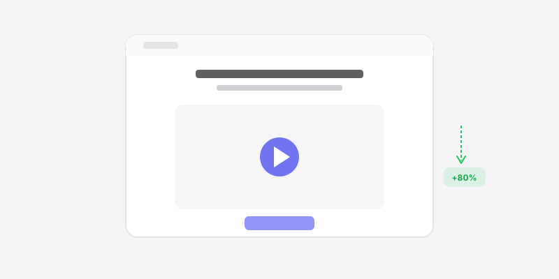
This shouldn't have surprised me. The data has been clear for years. According to Wyzowl's annual video marketing report, landing pages with video see conversion increases of 80% or more. Eyeview Digital found even higher - up to 86% in some cases. And yet, the majority of SaaS landing pages still don't have one.
Why? Because making a good demo video feels hard. So people put it off, tell themselves they'll do it "when the product is more polished," and keep grinding on headline A/B tests that move the needle by 0.2%.
Most SaaS demo videos are terrible
Let's be honest about why people are skeptical of demo videos. It's because they've seen a lot of bad ones.
You know the type. A three-minute video that starts with 45 seconds of "Company X is the all-in-one platform for teams who want to..." accompanied by stock footage of people smiling at laptops. Then a screen recording with a cursor that jumps around erratically while a voiceover reads what's already on the screen. The text is blurry. There's no zoom. You can't tell what you're supposed to be looking at.
That kind of video doesn't just fail to help - it actively hurts your conversion. It signals "we don't pay attention to quality." It signals "we made this because someone said we should, not because we thought about the viewer's experience."
The bar for a good SaaS demo video is actually pretty low. You just need to clear the bar that most companies trip over.
What a good demo video actually looks like
Keep it under two minutes. Ideally under 90 seconds.
That's the first and most important rule. Wistia's engagement data shows that viewer attention drops off a cliff after two minutes. For a landing page video - where someone hasn't committed to your product yet - you have even less runway. Sixty to ninety seconds is the sweet spot.
Here's what those 90 seconds should contain:
The first 5 seconds: Show the product doing the thing. Not a logo animation. Not a title card. The actual product, solving the actual problem. You have five seconds before someone decides whether to keep watching. Don't waste them.
Seconds 5-60: Walk through the core workflow. One workflow. Not every feature - just the main thing your product does. Show it working. Keep the cursor movements smooth and intentional. Zoom into the parts that matter so viewers aren't scanning a full-screen UI trying to figure out what happened.
Seconds 60-90: Show the result. The dashboard updated, the export completed, the report generated - whatever the payoff is. End on value delivered.
That's it. No intro. No outro with a logo spinning. No "schedule a demo to learn more." The video itself is the demo.
Why you don't need a production company
Here's where I think founders and product marketers psych themselves out. They assume a professional-looking demo video requires a videographer, a script writer, an editor, and a $5,000 budget.
It doesn't.
What it requires is a screen recording tool that doesn't produce garbage output. That's a low bar, but most built-in screen recorders and free tools fail it. They record at 1080p with frame drops, the cursor jitters around, and there's no way to emphasize what's happening on screen.
With Screen Bolt, I can record a polished demo video in under 10 minutes. Here's the actual workflow:
Step 1: Prep your screen (2 minutes). Pick a clean custom wallpaper - Screen Bolt has a bunch built in, or use your own brand colors. Open your product. Set up the starting state so you're ready to show the core flow. If there's anything on screen you don't want visible - Slack notifications, your bookmarks bar, whatever - use privacy blur to hide it.
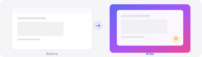
Step 2: Record the walkthrough (3-5 minutes). Load your talking points into the teleprompter so you don't ramble. Hit record and walk through the workflow. Auto-zoom will follow your cursor and zoom into whatever you're clicking on, so viewers always see the right part of the screen. The smooth cursor feature eliminates that jerky, erratic mouse movement that makes cheap screen recordings look cheap.

Step 3: Export (1 minute). Export at 4K/60fps. Done.
No editing. No post-production zoom effects. No color grading. The recording itself looks polished because the tool handles the production quality in real-time.
Ten minutes. And you have a video that's better than 80% of what's on SaaS landing pages right now.
"But our product changes every two weeks"
I hear this constantly. And it's the wrong way to think about it.
Yes, your UI will change. Yes, that means your demo video will go out of date. So what? Record a new one. It takes ten minutes.
The cost of not having a video on your landing page - right now, today - is far higher than the cost of re-recording one every month or two. You're leaving real conversions on the table every single day you don't have one.
Think about it this way: if your landing page gets 5,000 visitors a month and you're converting at 2.5%, that's 125 signups. If adding a video gets you to even 4%, that's 200 signups. That's 75 extra signups per month - every month you're sitting around waiting for the "right time" to make a video.
There is no right time. The UI will always be changing. Just record what you have now and update it later.
Where to put it
Above the fold. Full stop.
Not in a "Watch Demo" tab buried in your navigation. Not at the bottom of the page after 2,000 words of copy. Above the fold, auto-playing (muted, with captions if there's narration), right next to or just below your headline.
The video should answer the question every landing page visitor has: "What does this thing actually do?" Text can describe it. Screenshots can hint at it. Video shows it. And showing beats telling every single time.
Some teams embed the video as a hero element - it is the landing page, essentially. Others place it in a browser mockup frame next to their headline. Both work. The key is visibility. If someone has to scroll or click to find your demo video, most of them won't.
Add a webcam overlay (maybe)
For product demos on landing pages, I'd skip the webcam bubble in most cases. The focus should be 100% on the product. Save the face-to-camera stuff for YouTube walkthroughs and onboarding videos.
But - if you're a founder doing a personal, "let me show you what we built" style demo? A small webcam overlay can actually increase trust. It puts a real person behind the product. Screen Bolt lets you toggle this on and off and position it wherever you want, so you can experiment.
The real reason you haven't done this yet
It's not that you don't have time. It's not that your product isn't ready. It's that recording a demo video feels like a bigger task than it is.
It's ten minutes. Maybe fifteen if it's your first time. And the payoff - potentially doubling your landing page conversion - is one of the highest-ROI activities you can do for your product right now.
Stop tweaking button colors. Stop rewriting your subheadline for the fourteenth time. Record your screen, show your product doing the thing it does, and put that video on your landing page.
Today. Not next sprint. Today.
Ready to make better screen recordings? Download Screen Bolt for Mac and see the difference in your first recording.